
STAT – Statistics#
Overview#
Concept#
Workflow#
The statistics module STAT is a post-processing tool for Klippel database (*.kdbx) files. It
collects curve and scalar data from the operations of the input databases. All measures of one test
object are kept in relation to that test object itself. The test objects may be organized in pools
(e.g. to separate good, bad and borderline objects).
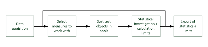
The general work flow is as follows:
Test objects#
The measurement results are always assigned to test objects. The entity of a test object depends on the application and may be defined within the STAT module. It is recommended to use the most atomic choice (operations before objects, objects before databases).
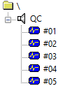
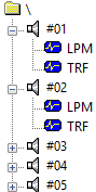
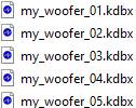
Possible choices with the example of five test objects:
One operation#
Test objects are organized as operations. The operations may also be organized in separate objects or databases (default for QC).
One object#
Test objects are organized in database objects and may comprise multiple operations.
One database#
Test objects are organized in separate databases and may comprise multiple objects.
Pools#
Test objects are organized in pools. Each pool can be named and be given a special color. The curves of all visible pools are plotted in one chart for one measure.
For each measure, one pool is selected to be the reference pool. This reference may be used for the normalized views and for limit calculation.
Note
From STAT v1.870 the initial pool colors are not randomized anymore. When creating a pool a separate file is scanned for the initial color of a pool. The file location is %programdata%\Klippel\<dB-Lab-Instance>\Scripts5\Klippel\STAT\colors_new_pool_rgb.txt. If any syntax errors in the hex color definition are detected or the file is not found, a random color is chosen.
New test objects (newly extracted) are always assigned to the general pool. Test objects are moved from one pool to another
manually in the window Pool Assignment
by comparison of measurement data to defined limits.
System Requirements#
Working installation of dB-Lab version 210.430 or later
License device and STAT license
4 GB of free RAM (recommended: 8 GB)
Recommended: fast hard drive (e.g. SSD) for %TEMP% folder
db extract version 3.142 or later
Tutorial#
Setting up a new statistic#
Open an existing database or create a new, select object  and create a new STAT operation.
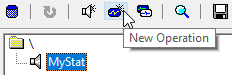
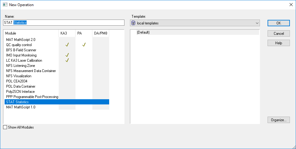
After the initialization is finished, open the property page  (Source Data tab) and open
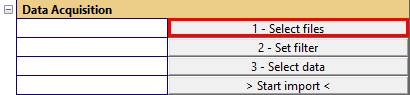
the dialog to select the input data.
(Source Data tab) and open
the dialog to select the input data.
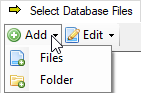
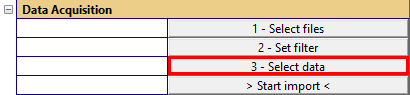
Add separate files or a folder.
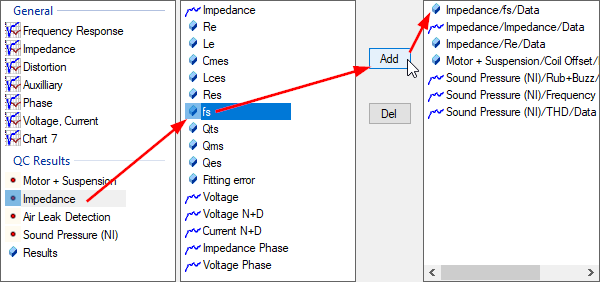
When the input data is added, it is time to select the results to be extracted. To do so, open the results selection dialog.
Now it’s time to start the extraction.
Note
A parallel instance of db extract is started which prepares the data for the STAT module. While db extract is still open, the STAT module will read and clean the data parallel. The progress bar in dB-Lab indicates how much data has been read compared to the (currently) extracted data.
When the extraction is finished, change to the Processing tab and category Select measure and inspect the parameter Select … - you should have multiple measures available.
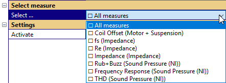
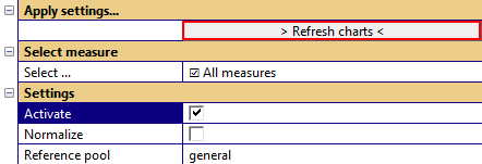
Please keep the choice All measures and check the parameter – Activate measure. After using the > Refresh charts < button
the charts are created.
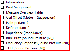
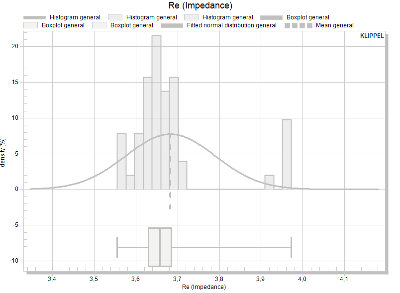
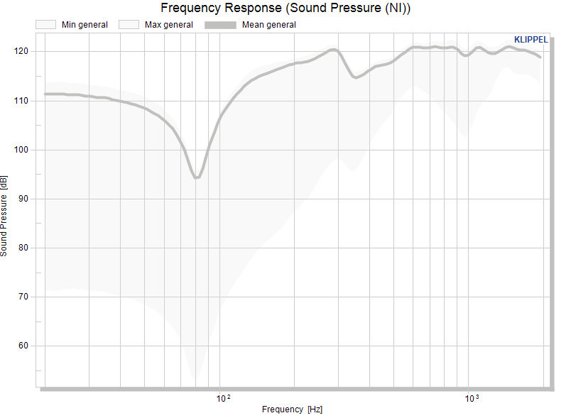
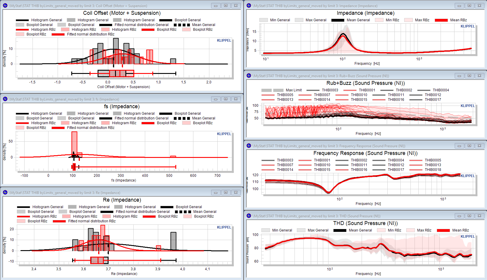
When the calculation is finished, the statistical overview is visible: each window contains the statistical representation of the measurement data of the test objects. They can now be arranged in separate pools.
Note
The STAT is designed to collect the entire common x-range and restrict all data to that range. Ensure you use a similar x-range for all databases; otherwise, any extended range will be excluded.
Working with pools#
Arranging the test objects of your statistic requires a possibility to group them. The STAT module calls this pooling.
Hand-pick test objects#
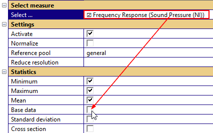
The pool assignment of test objects may be done manually (e.g. sorting by prefix or by known serial numbers). For identifying outliers by serial number, it may be beneficial to activate the plot of individual data.
Note
Showing huge amounts of data in one or multiple charts will slow down the STAT module. If you end up with thousands of curves for a measure, it’s not recommended to activate the base data.
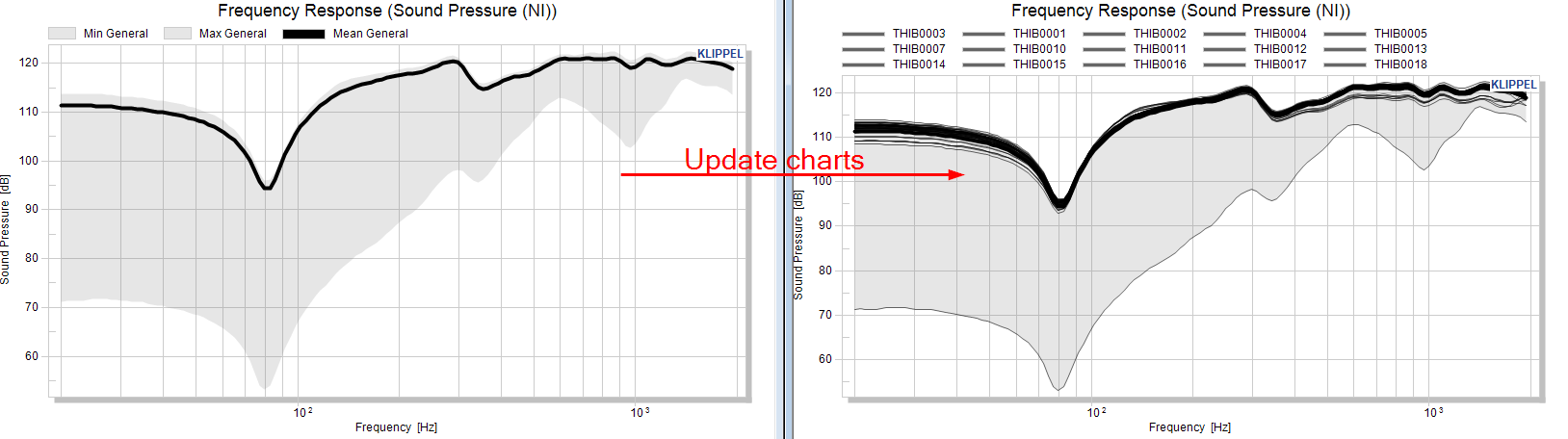
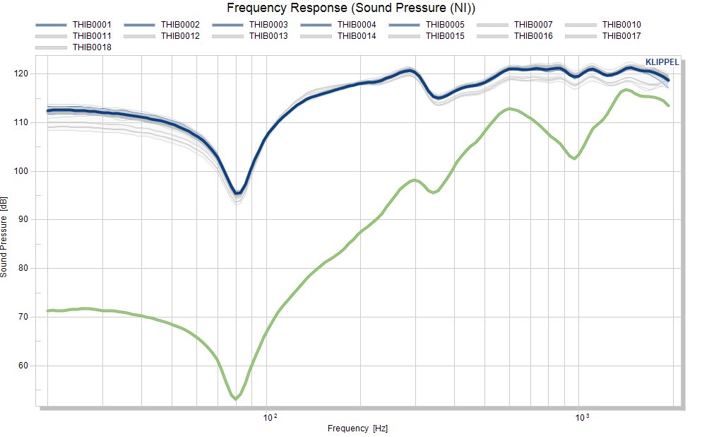
The window for the frequency response contains the individual curves after using the Update charts button.
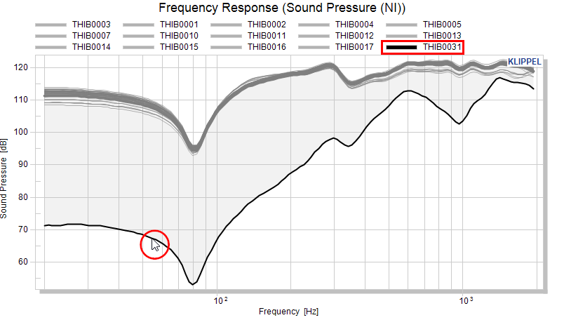
The serial number of the outlier is highlighted after selecting the curve with the mouse.
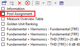
After we know the serial number we want to move, we can open the window Pool Assignment, create a new pool and move the test object:
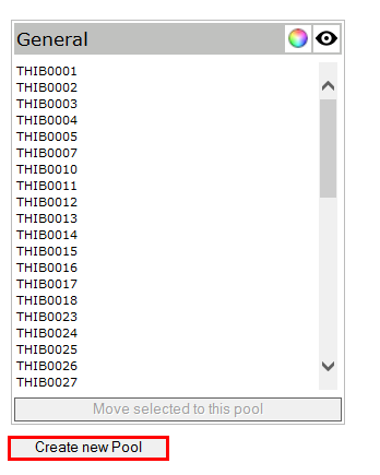
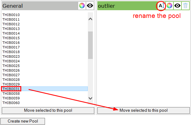
We’re giving the new pool a proper name (outlier), select the serial number of the test object we want to move and hit the button for the target pool.
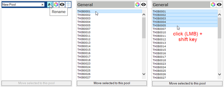
Let’s say we want to move the first five serial numbers from the General pool to another pool named Good stuff. First create a new pool and rename it. Then click the first serial number with the mouse. Then hold SHIFT and click on the fifth serial number to mark the range.
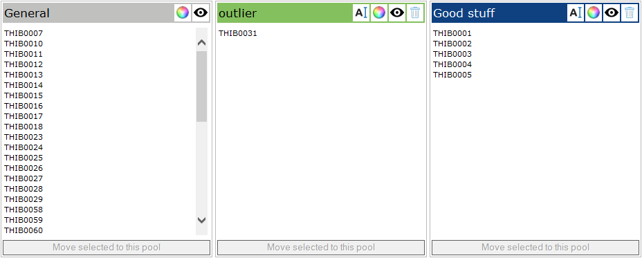
The button below the new pool assigns all marked objects to that pool.
Move objects based on thresholds#
Note
This tutorial presents the definition of absolute limits in absolute view mode. Please make sure you don’t have a normalized view (uncheck - Normalize data to a reference) and you’re defining absolute limits (set Absolute limit as limit calculation mode. Please refer to section Interpolation of limit definitions and Interactive limit definition for defining other limit types in absolute and normalized view modes.
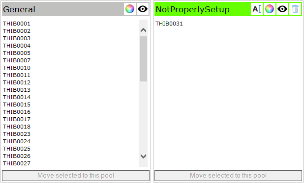
Moving objects by hand might not be the fastest way to separate the objects in sensible groups. This chapter describes the work flow for moving the objects by thresholds. We’re starting with the pool configuration from the last chapter. Since the pool with test object “THIB0031” is not valid, we can rename the pool to NotProperlySetup. The pool Good stuff is deleted, which moves all test objects back to the general pool:
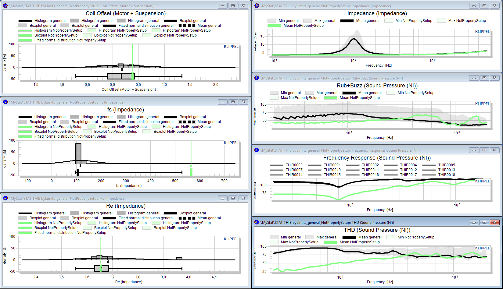
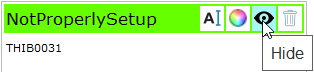
Let’s assume that we want to separate good objects from bad objects and borderline objects. We already identified the obvious outlier, we’re renaming that pool to NotProperlySetup. Since this is not a valid measurement, we don’t want to be distracted by this and we’re disabling the visibility of that pool.
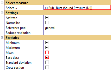
Now let’s focus on the Rub&Buzz measure. We’re enabling the individual data for this measure to view the complete raw pool. This is not necessary but provides a better relation to the actual data. Additionally we’re disabling the mean curve.
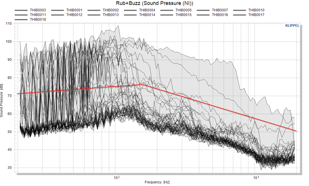
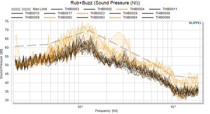
Now let’s separate objects with obvious Rub&Buzz defects by using visual limit. The red line shows an educated guess of a first threshold that we want to use for the separation of good and bad objects.
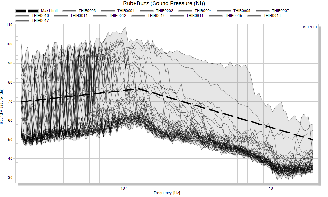
Activate the maximum limit for Rub&Buzz and select the absolute limit calculation mode.

Now we start to approximate the red line with points and enter the matrix in the parameter ‑ Absolute max limit.
20   70
130  77
2000 50
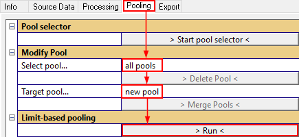
Before moving the objects, adjust the parameters Select pool… and Target pool… setting that defines what the source and target pool of the moving is. We want to move everything from the general pool (and leave the pool NotProperlySetup as it is) to a new pool.
OK, now let’s move every object from general that is violating the limit to a new pool.
Note
the current pool assignment is also visible in the HTML window Pool Assignment.
We’ll give the new pool a name and the color red:
We want to continue to find our good pool, so let’s hide the RBz pool as well.
Now let’s do another sorting on the RBz to catch the borderline objects:
20   60
50   62
130  70
700  50
1000 44
2000 42
For now we’re also not interested in examining the Borderline pool (it will definitely be interesting to compare out limits that we define later against this pool) and disable the visibility.
Note
Section Calculating and Exporting Limits introduces limit setting in greater detail and shows the (more comfortable) interactive mouse input of limits.
Statistical Investigations#
After selecting our good pool, we can investigate how several measures spread.
Normalization view#
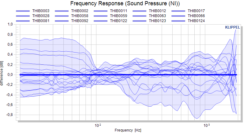
Looking at the frequency response does not really give a good impression on the spread.
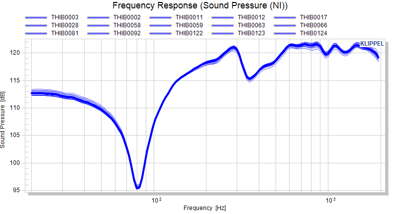
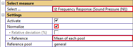
We can activate the normalization mode to subtract the mean of the measure from all displayed curves. After using the Update charts button, the differences are plotted.
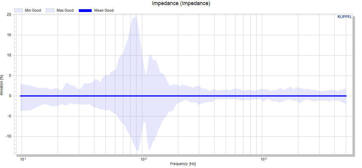
For linear measures, a relative normalization is available, displaying the deviation from the reference curve in percent. This is not available for measures in dB or %.
Cross section view#
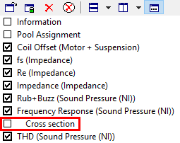
The cross section view generates a scalar distribution of curve data at a selected position on the abscissa (x-axis). After activation of the cross section, parameters for scalar values are shown also for curves.
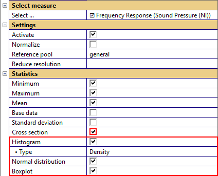
After using the Update charts button another chart is shown in the list, right below the default chart of the corresponding measure.
In the default chart of the measure a horizontally movable cursor defines the position on the abscissa.
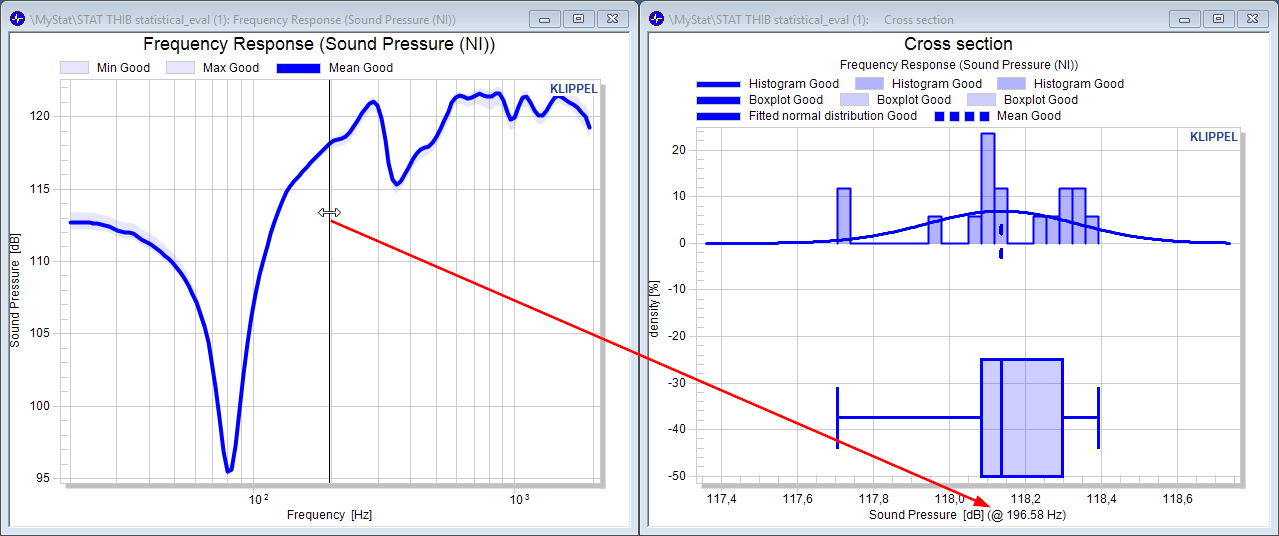
All settings applied of the measure (e.g. normalization or show flags) also applies for the cross section chart.
Factorizing standard deviation#
Under the assumption that the data is normal distributed, the factorized standard deviation factor may be plotted along with the other statistical or individual data.
If All measures or a scalar measure is selected (parameter Available measures), a scalar value is allowed as standard deviation factor.
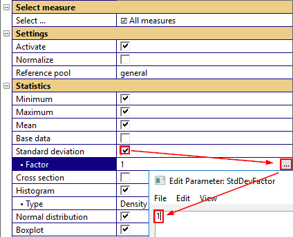
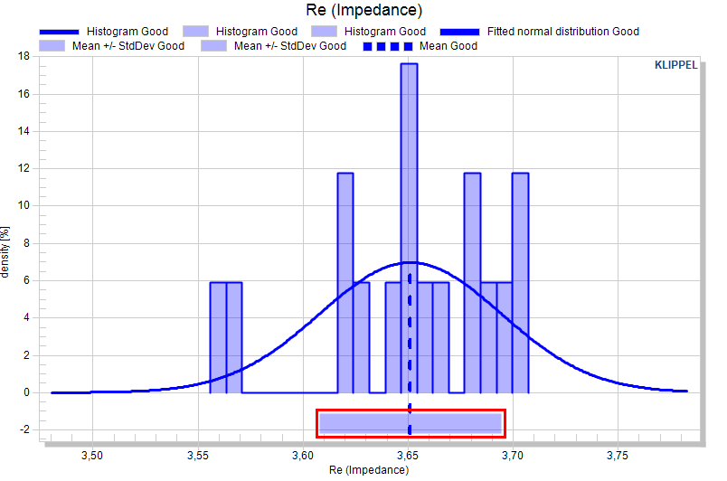
If the selected measure is a curve, the standard deviation factor may be a two-column curve definition (factor dependent on abscissa) or a scalar (constant factor versus abscissa).
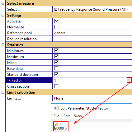
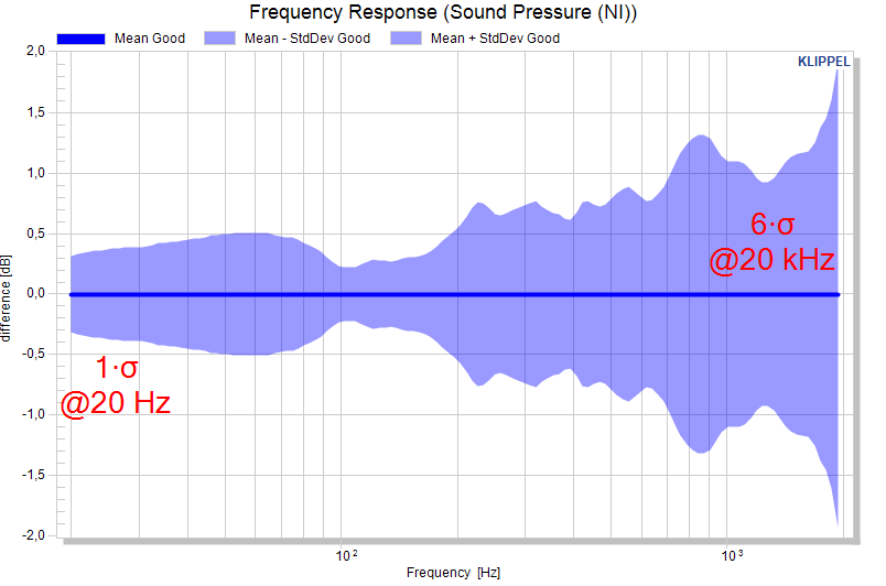
The factorized standard deviation plots are shown in absolute view and normalized views.
Calculating and Exporting Limits#
Please make sure you’re defining absolute limits
Note
For beginners it is recommended to use the same view mode (absolute, normalized) as the limit definition. Different limit and viewing modes may be confusing for unexperienced users, especially for curve data. Please always check the defined limits also in absolute view mode.
Activating limit calculation#
First, select the measure for which you want to calculate a limit.

Then choose the limits that shall be calculated.
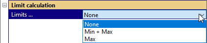
The limit definition may be entered as a two-column vector for curves and scalars for scalar measures. The limits may be entered in the corresponding parameters (depending on the limit calculation mode).
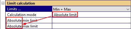
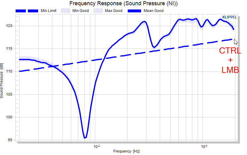
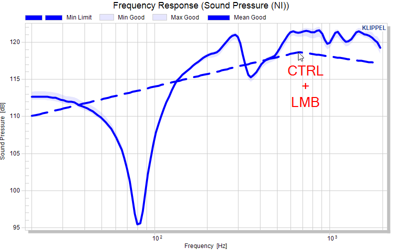
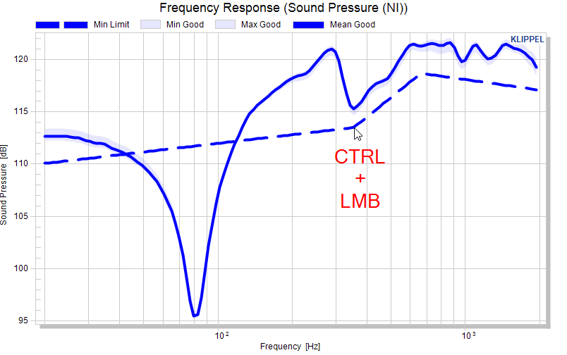
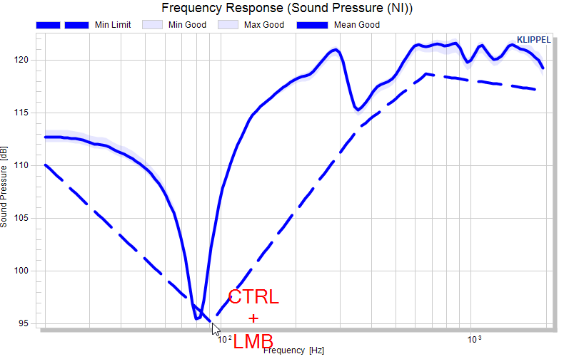
An alternative is the mouse input with left mouse button LMB in the chart of the measure: Activating the maximum limit activates the mouse input with the SHIFT key. The min limit activates mouse input with the CTRL key.
Limits for scalar measures#
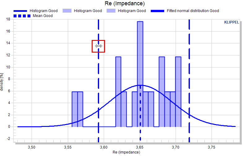
Using LMB + SHIFT / CTRL in the chart defines the max/min limit for the measure. Clicking again with the same key, re-defines the limit.
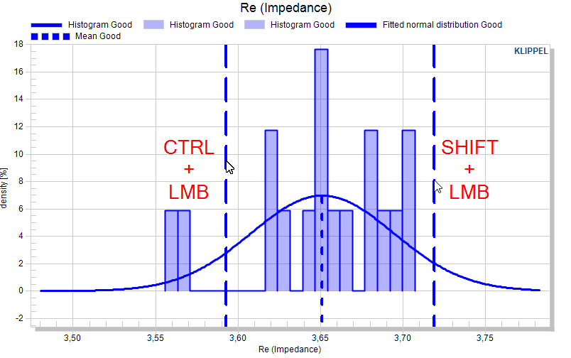
The limit curves are also dragable with the mouse.
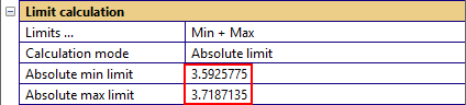
The limit definition is directly entered into the corresponding parameter.
Limits for curve measures#
As for scalar measures, limits for curve measures may be entered directly in the parameter fields (as two-column matrices) or entered with LMB + SHIFT / CTRL.
An example for defining the minimum limit as an absolute curve:
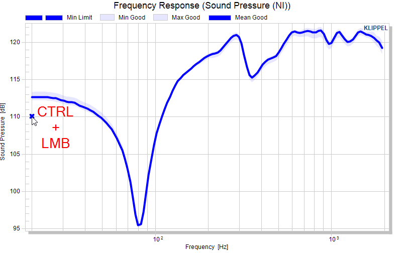
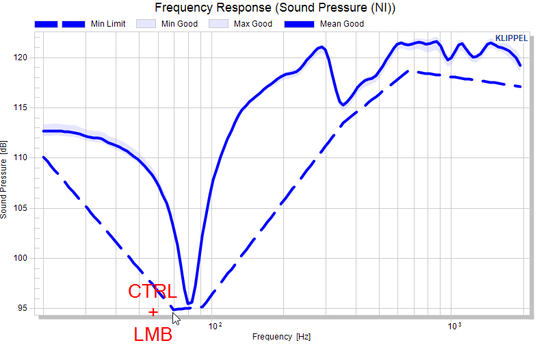
And so forth….
Eventually, we’re defined the complete max/min limit curves.
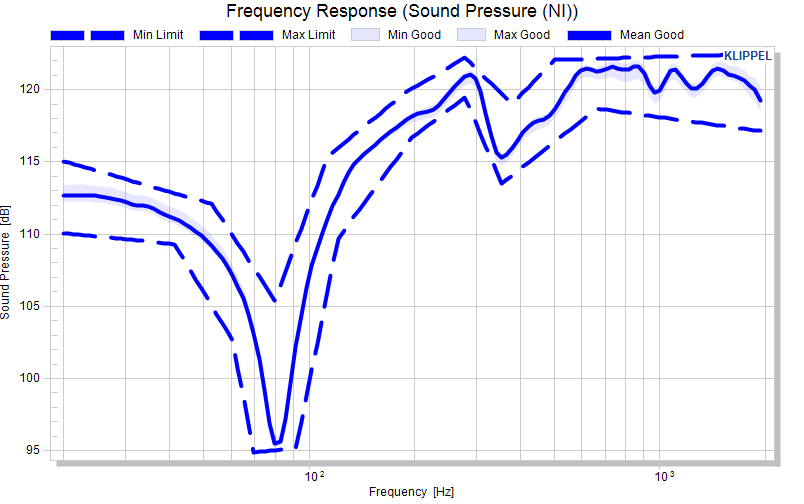
Correcting limit points is possible by defining a new point at the same x-position of a point, but this depends on the resolution of your source data. Another possibility is to edit the matrix definition and erase or correct lines.
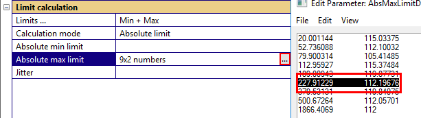
Another limit parameter for curves is the jitter which widens the limits horizontally. The definition is again a two-column matrix (or a scalar for constant jitter).
Note
Jitter is defined as a percentage of the frequency. At 380 Hz, a 10% jitter will look around 38 Hz and relay the limit for 380 Hz to the minimum/maximum of that range.
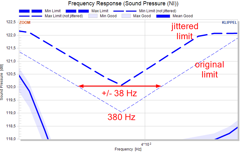
Export limits#
To export the calculated limits, change to tab Export and select the measure frequency response.

Then, go to category Text export and select calculated limits to be exported.
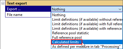
Repeat this step for all limits that you want to export and use the export button.

Reference#
User interface#
Tab source data#
Data Acquisition#
The source data (Klippel .kdbx databases) needs to be extracted and converted. This extraction is performed by db extract. The individual buttons call different parts of the configuration dialog of db extract.
Please refer to the db extract manual for detailed descriptions of the user interface.
Note
Changes in these dialogs have no impact on data that is already inside the statistics. If data is added to the statistic, it is recommended to remove input data that was previously added to the statistic.
- Select files
Opens the dialog to manage the input data.
- Set filter
Specifies filters for including only a filtered set of operations.
- Select data
Opens the dialog for selecting the measurement results that are under statistical observation.
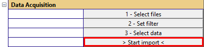
- > Start import <
Runs the extraction and reads the extracted data and converts them into the statistic format.
Note
Extracted test objects that are re-read during another extraction are ignored based on an internal ID. This ID changes when a database is copied to another location.
Settings#
The parameters in this category define general settings that apply to all test objects.
- Test object
Defines the unit of a test object. For QC data this is usually an operation
 (one operation comprises a set of test for one object).
For RnD Data or special QC cases a test object might be an object
or a database
(one operation comprises a set of test for one object).
For RnD Data or special QC cases a test object might be an object
or a database  .
.- Serial number
Test objects are identified by serial numbers. The serial number may be used directly from the module (currently only QC modules) or the serial number may be generated from the source data’s location. The choice depends on the organization of the data and the test object definition.
Possible choices are dependent on the test object definition.
Note
Please note that changing the test object definition causes a recalculation of the data and hence discards the current pool definitions and measure settings.
Serial number definition |
Available for test object definition |
|---|---|
Module SN (QC only)
Only applicable for QC operations. If no serial number is available, a unique serial number is generated.
|
|
Operation name |
|
Operation path |
|
Operation path + database name |
|
Object name |
|
Object name + database name |
|
Database name |
|
Generated
A unique serial number is generated
|
 Operation
 Object
 Database
 |
Example#
We have two databases with TRF operations where we want to extract the Fundamental curve:
-
SN00001.kdbx
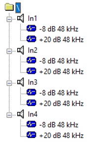
-
SN00002.kdbx
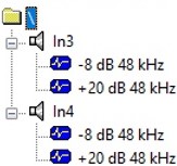
The definition for a test object defines the number of test objects and the number of measures. Assuming that the Fundamental curve is extracted from all operations, we get different number of measures and test objects.
- Database
Number of test objects: two, because we have two databases
Number of measures: eight, because we have eight different operation paths for the Fundamental in our test objects:
\In1-8 dB 48 kHz
\In1+20 dB 48 kHz
\In2-8 dB 48 kHz
\In2+20 dB 48 kHz
\In3-8 dB 48 kHz
\In3+20 dB 48 kHz
\In4-8 dB 48 kHz
\In4+20 dB 48 kHz
The first four measures are not available in the second database, hence it contains only data from the first database.
- Object
Number of test objects: six, because we have four different object names in all our databases. The second database does only contribute two test objects.
Number of measures: two, because in each test object there are only two different operation names of the same type.
-8 dB 48 kHz
+20 dB 48 kHz
- Operation
Number of test objects: 12, because in all our databases 12 operations of the same type exist.
Number of measures: one, because we have only one operation type (and use only one curve).
Tab Processing#
Apply settings…#
The only parameter in this category is a button that triggers a chart update. Changes in the category Data processing have to be applied with this button.
Select measure#
The only parameter in this category selects the measure of which the settings are changed with the remaining parameters in this tab (categories Settings, Statistics and Limit calculation).
If All measures is selected, changes are applied to all measures.
The list reflects also the active status flag of the individual measures.
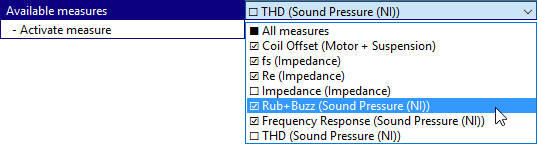
The entry All measures refers to all measures in the list. If measures are configured individually, checkboxes are set to undetermined and other parameters are set to (varying).
Settings#
- Activate
This checkbox activates a measure. When a measure is activated, a dedicated window in created to show the graphical representation of that measure. The active status is also shown in the measure list in parameter Available measures.
- Normalize
This checkbox enables the normalization view.
- Relative deviation (%)
If this checkbox is set, the normalization is calculated as deviation from the reference in %. Otherwise it is the difference to the reference.
This parameter is disabled for curves in dB or %.
- Reference
Defines the reference for the normalization.
Available references:
Mean of each pool: Every pool is normalized to its own mean curve or value. Please note that this forces all mean curves to be equal (at y = 0). If test objects are compared to limits (e.g. when moving based on limits), this setting might show results that are visually unexpected (please refer to section Limit Calculation and Export).
Mean of reference pool: All pools are normalized to the mean curve or value of the reference pool.
Imported data: All pools are normalize to the curve or value defined as – Reference data.
- Imported reference
This parameter is only shown if reference is set to Imported data. This parameter defines a single value (for curve and scalar measures) or a two-column curve (for curve measures) that is used as a reference. Here the measurement data of a golden unit may be pasted.
- Reference pool
This select list defines the reference pool for the selected measure. Available are all pools, including the general pool. The reference pool is used for normalization views (if the reference is defined as Mean of reference pool) and for limit calculation.
- Reduce resolution
This parameter reduces the original resolution of curve data to a defined target resolution. The entered value is interpreted as a relative resolution (points per octave) for frequency axis and as a total number of points for all other axis types.
This feature is applicable to:
Linear and logarithmic frequency spacing
Linear and dB scale values
Full resolution spectra (correct power summation)
Two additional parameters Mode and Data type control the processing (automatically configured for common data types).
- Mode
The Mode defines how the original data points are combined:
Mean - arithmetic mean
Max – max value
RMS – root mean square
Energy – level addition (energy sum) for spectrum
Data Type parameter is considered for calculation (e.g. data is delogarithmized).
- Data type
This switch defines whether the curve y-axis data is interpreted as linear or logarithmic level (dB) data.
Statistics#
- Minimum
Shows the total minimum for each pool. Only available for curves.
- Maximum
Shows the total maximum for each pool. Only available for curves.
- Mean
This checkbox activates the plot of the mean curve/value for both, curve and scalar measures.
- Base data
Shows the individual test objects for the selected measure. Applied to all pools.
- Standard deviation
Activates the factorized standard deviation plot for the selected measure.
- Factor
Factor for the standard deviation that defines the factorized standard deviation plot. Single value for scalar measures or constant values (curves). Two column format for curve entry.
- Cross section
Activates cross section view for the selected measure. Enables distribution parameters (Histogram, Histogram type, Normal distribution, Boxplot) for curve measures.
- Histogram
Shows the histogram plot
- Type
Type of histogram. Either as density or absolute count.
- Normal distribution
Activates the fitted normal distribution plot.
- Boxplot
Shows the measure divided in quartiles.
- Plot Measure Versus
This option is available for all single value features (and cross sections). If activated, a separate plot is generated that plots the single value versus an independent variable. The most common usage is plotting a time-couse.
Limit calculation#
- Limits …
Selects which limits shall be calculated for the selected measure. Available choices:
None
Min + Max
Max
- Calculation mode
Defines the calculation mode for the limits. Available modes:
Shift mask
Sigma factor mask
Absolute limit
Factor mask
- Absolute/Shift for/Sigma for/Factor for min
Definition for minimum limit (Absolute, Shift limit or Sigma factor).
- Absolute/Shift for/Sigma for /Factor for max
Definition for maximum limit (Absolute, Shift limit or Sigma factor).
- Jitter
Jitter definition. Only available for curve measures versus frequency.
Tab Pooling#
Modify pool#
- Select pool…
Selects the (source) pool for all actions
- > Delete Pool <
Deletes the selected pool
- Target pool…
Selects a target pool for the limit-based pooling
- > Merge Pools <
Merges the source and target pool
Limit-based pooling#
The only button in this category runs the limit-based pooling. All test objects of the selected pool that violate the defined limits are moved to the selected target pool.
Automatic classification#
This feature is not yet available.
Tab Export#
Text export#
- Export …
Defines the export.
- File name
Defines the filepath for the text export. Absolute and relative (referring to the database location) paths are allowed.
- > Start text export <
Starts the text export
Statistical plot options#
Minimum and maximum curve#
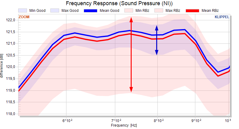
If the minimum and maximum curves are activated, the total minimum and maximum for each pool is plotted. If both, the minimum and maximum curve, are active, the area between the minimum and maximum curves colored to show the range of the pool.
Note
The minimum and maximum values of scalar measures can be visualized with the boxplot.
Mean curve/value#
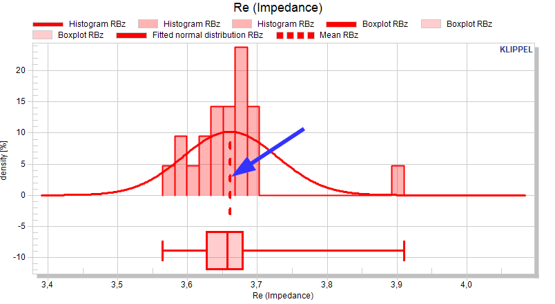
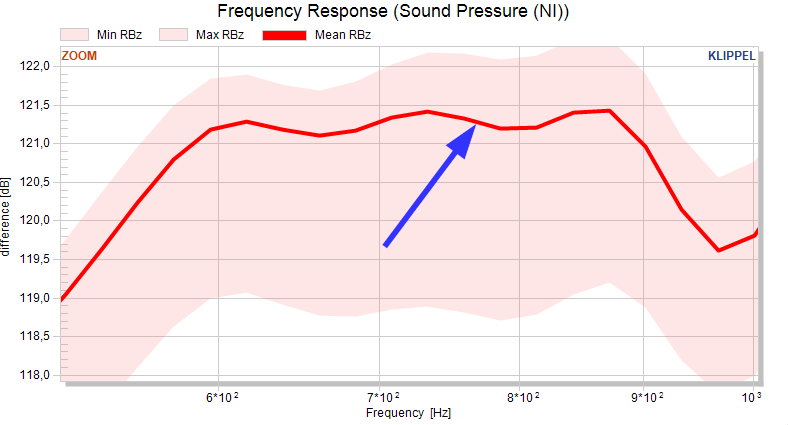
If the mean is activated, a mean curve for scalar and curve data is plotted. The mean of a measure in a pool \(p\) is calculated as the linear average of a pool
resp.
Units are not considered in the calculation of the mean, hence the mean is the visual mean of the pool. The mean of scalar measures is plotted as a dashed line. The mean of the curve measures is plotted as a solid thick line.
Base data#
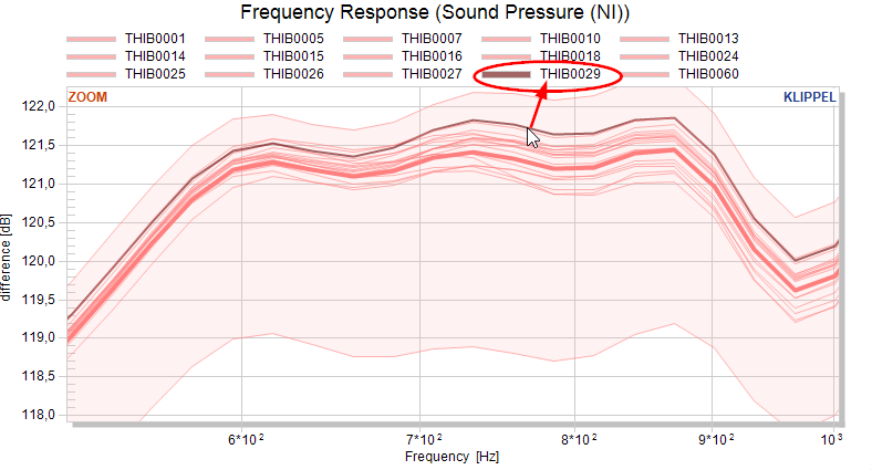
If the base data plot for a measure is active, the data for each test object is (interpolated on a common abscissa). This enables point&click to identify the serial number of a (visually selected) test object.
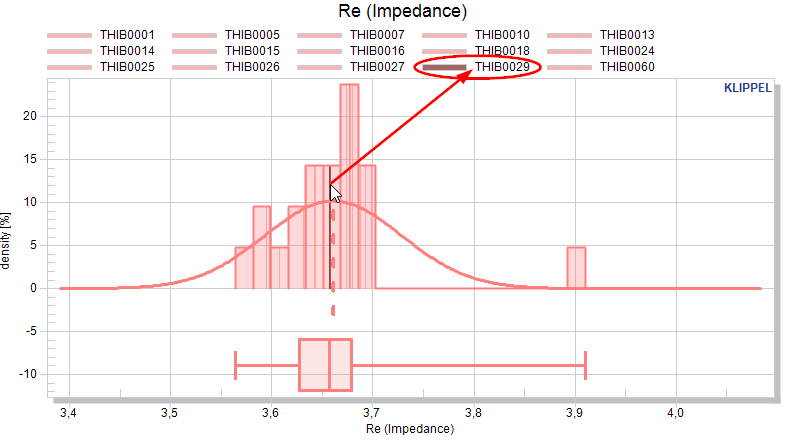
Note
Showing huge amounts of data in one or multiple charts will slow down the STAT module. If you end up with thousands of curves for a measure, it’s not recommended to activate the base data.
Cross sections#
The cross-section view is only available for curves. It represents the scalar representation of curve data at a specific position on the abscissa. If the cross-section view is activated, a dedicated chart is created below the standard chart of this measure.

If the cross section is active for a measure, configuration parameters are shown that refer to scalar measures (flags for bar distribution, distribution type, fitted normal distribution, boxplot).
A horizontally movable cursor is generated in the default window of the measure to define the position of the cross section.
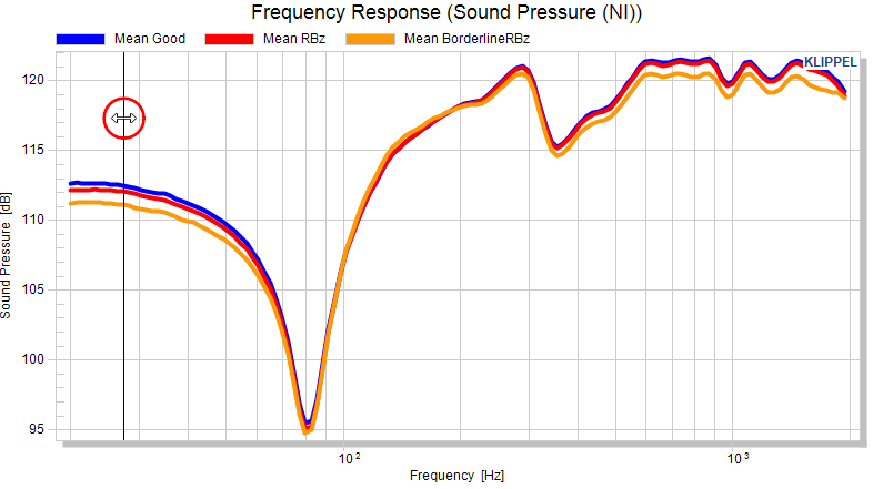
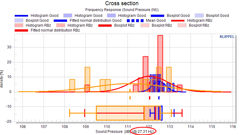
All flags (e.g. normalized view) for the measure apply also for the cross-section view.
Limits may also be defined and changed in the cross-section view.
Factorized standard deviation#
If the factorized standard deviation is active, a normal distribution of the measure is assumed and the factorized standard deviation is plotted. For scalars the factor is defined as single value, for curves measures single values (constant factor versus x) or curve definition are allowed.
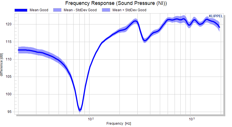
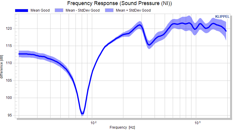
The resulting curves are the mean plus/minus the factorized standard deviation.
Example: Showing the 3σ distribution of a measure:
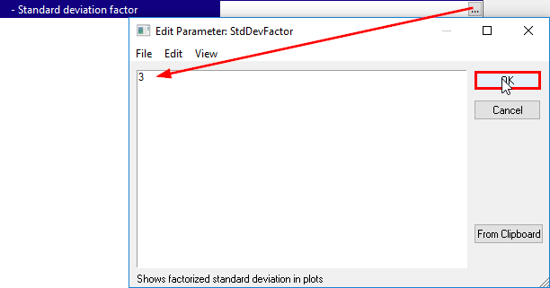
A abscissa-depending factor for curves is defined as a two-column matrix, e.g.:
20    3
200   3
400   6
20000 6
Distribution plots#
Histograms#
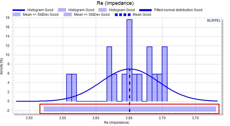
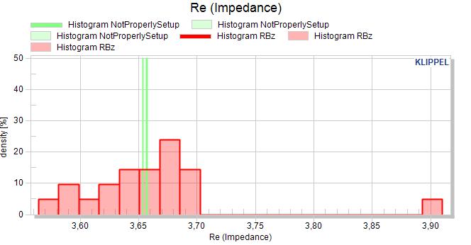
Histograms are show a bar-plot for scalar measures (and cross-section view).

The bars are distributed equally between the minimum and maximum of a pool. The number of bars is defined with 20.
The histogram type can either be set to Histogram or Density.
In a histogram, the absolute count defines the height of each distribution plot. This may be used to display the absolute number of test objects in a distribution plot.
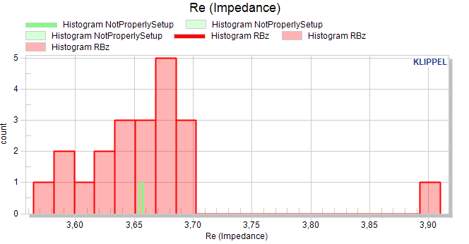
In this plot, classes with comparatively few objects may be visually underrepresented.
The density plot normalizes the height to the number of objects on a pool. The summed bar height of each bar distribution plot is 100%.
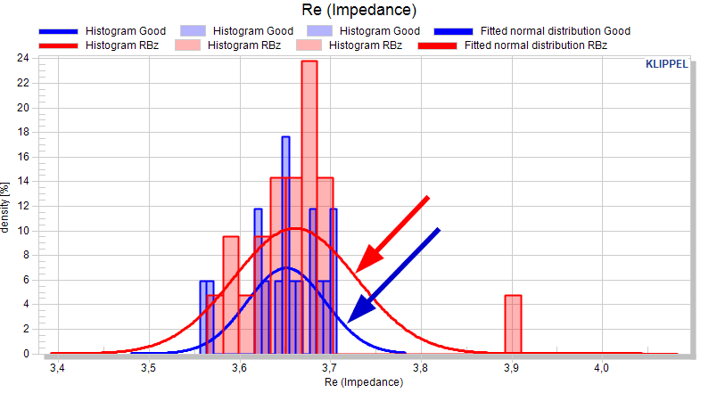
Fitted normal distribution#
If the curve is activated, a normal distribution of the measure is assumed and the normal distribution is plotted for each pool.
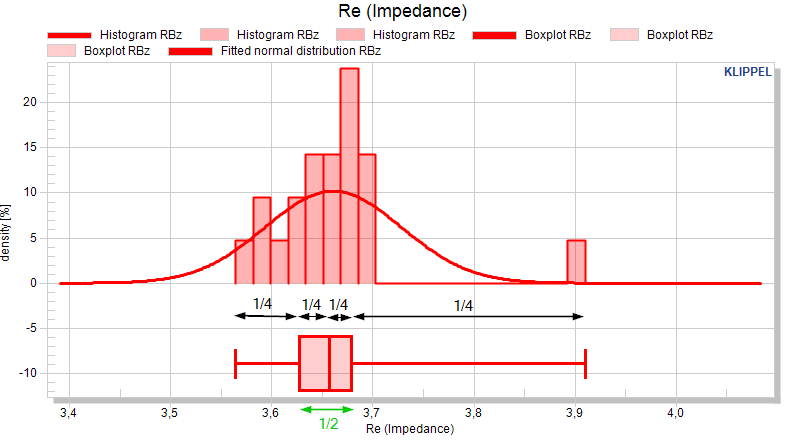
Boxplot#
The boxplot shows the distribution of a value in quartiles which divide the data into four equal groups of 25% of the objects.
Normalize plots#
If the normalization for a measure is active, the measure is not plotted in its original ordinate, normalized to a reference. The reference is subtracted of each curve in the charts, if the normalization is not defined as relative deviation (%).
For the relative deviation, the resulting curve is defined as
This also applies for scalar and cross section plots.
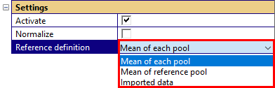
Reference definition#
For each measure a reference is defined that is used for
Normalize plots
Limit calculation
Detection of Golden Units
The reference is defined as \(y_{\text{ref}}(x)\) for curves and as \(y_{\text{ref}}\) for single values, respectively. The data is one of the following:
Mean of each pool
Mean of the reference pool
Imported data
The selection is defined in tab Processing, category Settings for the selected measure or all measures.
Time- and other Dependencies#
The option Plot Measure Versus

provides the possibility for showing the dependence of a single value feature (or cross section data) versus an independent feature. Two options show the time-dependency:
The option Time shows the feature versus the absolute measurement time. The option Statistical Sample shows the feature versus subsequent statistical samples.
Versus Time and
Versus Objects
All active features that are either single values or cross sections may be used as independent variable. For example:
To show the dependency of a single value versus temperature, the temperature information needs to be extracted from the source data.
It is possible to identify the serial number of single test objects in the dependency plots. For that use ALT and click on the data point of the test object in the dependency plot. The serial number of the object is displayed as a text annotation.
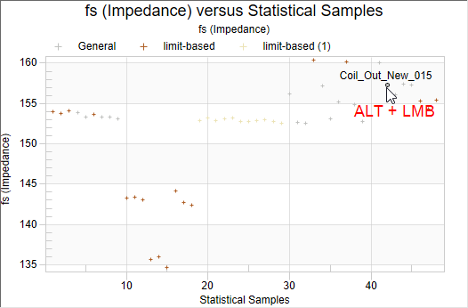
To select another object just use ALT + LMB again. To remove the annotation, use ALT + right mouse button ( RMB ).
Note
this feature does not work in a time-dependency chart.
Limit calculation#
If limits are enabled for a measure, relative and absolute limits are defined by matrix or interactive input.
Modes#
The parameter - Calculation mode defines the mode of limit calculation. The following options are available:
Shift mask: This limit calculation mode defines the limits by taking the mean curve of the reference pool and opening the tolerance by the defined shift.
Sigma factor mask: This limit calculation mode defines the limits by applying a factor (for curves depending on the abscissa) to the standard deviation of a pool.
Absolute limit: Limits are defined with absolute values.
Factor mask (mul): By defining a factor, the limit is calculated by multiplying the factor with the mean of the reference pool. This mode is only available if the measure is not in dB or %.
Depending on the parameters Limits for “…” and – Calculation mode the parameters for defining the minimum and maximum limit are shown. For scalar and curve measures a single value can be used to define a limit.
Jitter#
The parameter – Jitter (only shown for curve measures) defines a jitter mask to widen the limits horizontally. Jitter may be specified as a single value (constant jitter versus the abscissa) or as two-column curve.
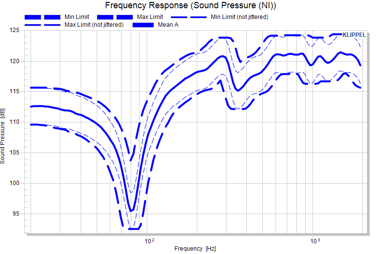
The jittered limit is calculated from the unjittered limit \(y_{\text{Min/MaxLim}}\left( x \right)\) and the jitter definition \(j(x)\).
If a jitter definition is defined, the unjittered limit definition (thin dashed) and the calculated (jittered) limit (thick dashed) are both shown.
Note
Even if limits are not defined absolutely (shift, sigma factor, factor), the jitter is applied to the calculated absolute limit.
Interpolation of limit definitions#
For curve measures, limits are often not defined on the original abscissa. However, the resulting limit is always calculated on the full abscissa. Data points in between the limit definition are interpolated. The defined limit is interpolated, not the calculated limit. Logarithmic axes are taken into account.
Examples#
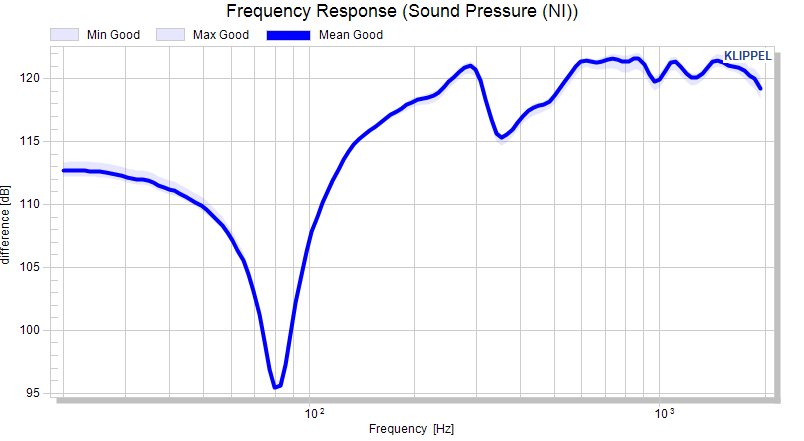
Examples (frequency response, logarithmic abscissa, linear ordinate) to illustrate the effect:
Curve without limits#
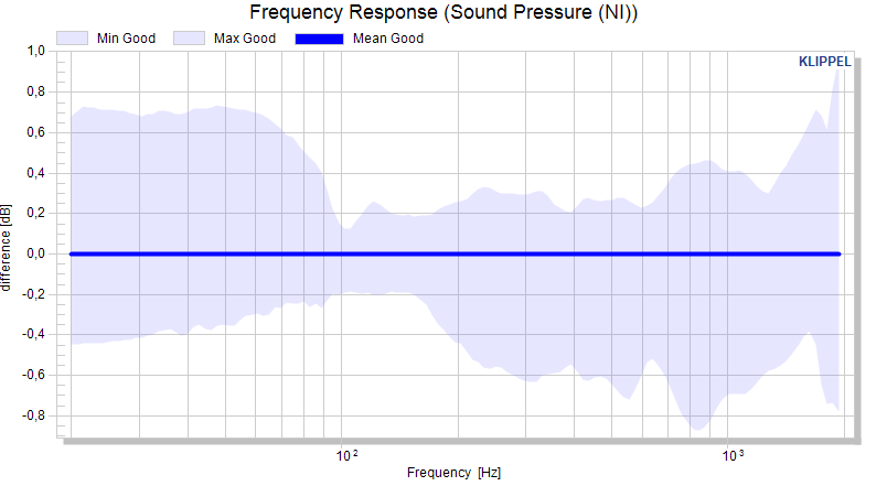
Absolute limit#
Max
20   115
200  130
2000 125
Min
20   110
200  115
2000 115
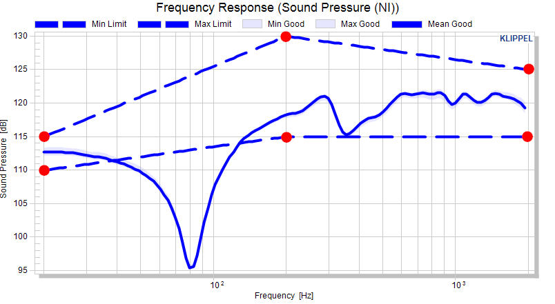
The absolute limits are interpolated, which is understandable in absolute limit mode. Definition points are highlighted.
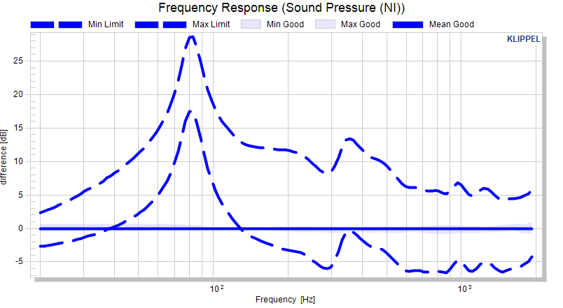
The absolute limits are interpolated as shown in the absolute view. Now, the calculated curves are normalized (mean is subtracted).
Shift limit#
Max
20   6
200  6
2000 6
Min
20   -3
200  -6
2000 -0.1
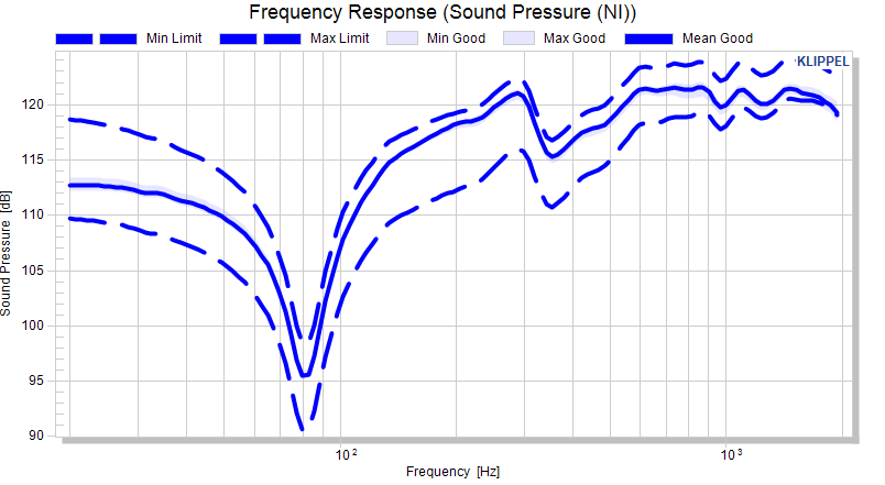
As the shift definition is interpolated (and not the calculated limit at the defined abscissa definitions), the resulting limit follows the mean curve with varying distance
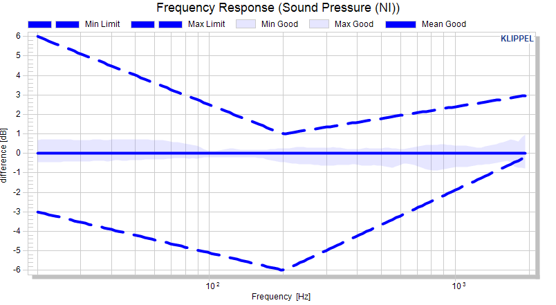
The shift definition is interpolated to the required abscissa. This looks also reasonable in normalized view.
Shift limit with constant 10% jitter#
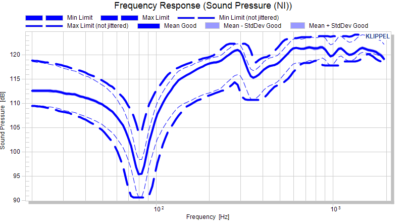
The jitter algorithm widens the limit horizontally which is quite straightforward in the absolute view. The unjittered limits are shown as thin lines to visualize the effect of jitter.
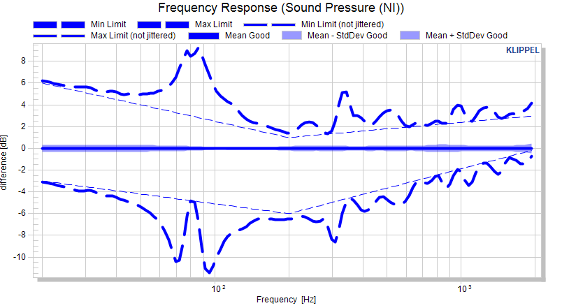
In the normalized view, the unjittered limit is still a straight line. The absolute limit is jittered and normalized (mean subtracted). Since the distance between jittered limit and reference curve (mean) varies, the normalized limit is not a straight line anymore. The effect is illus-trated with the thin lines which represent the unjittered limits.
Sigma factor limit#
Min
20     1
200    10
2000 3
Max
20     1
200    10
2000   3
In this example, the area plot shows the ±σ distribution around the mean curve.
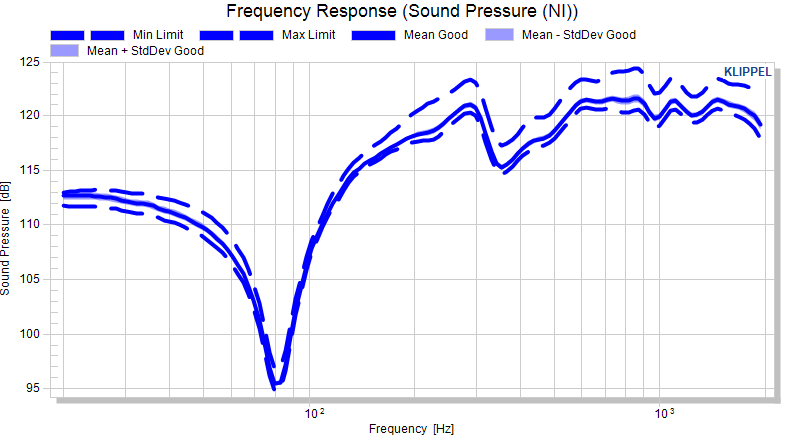
The sigma factor is interpolated and the resulting absolute limit spreads with the standard deviation of the pool.
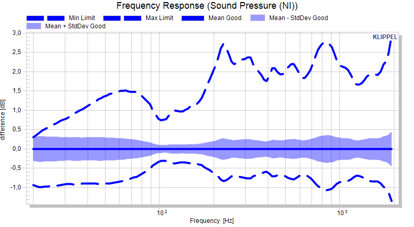
The normalized plot shows the effect of the factorized standard deviation clearly. Still the limit is not a straight line.
Interactive limit definition#
Once a measure is set up to have limits, the default charts (not cross section charts) of the measures are sensitive to mouse input.
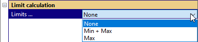
Using left mouse button (LMB) and SHIFT / CTRL limits may be defined directly in a chart.
LMB + SHIFT defines the maximum limit as the current xy position
LMB + CTRL defines the minimum limit at the current xy position
Limits for scalar measures#
For scalar measures the limit is defined by only one value. Using the input again, will overwrite the limit. For scalar measures, the limits are also dragable.
The limit definition is directly entered into the corresponding parameter.
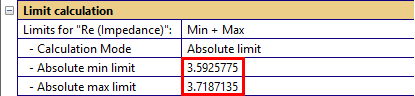
Limits for curve measures
An example for defining the minimum limit as an absolute curve:
And so forth….
Defining a limit at an abscissa position that is already defined overwrites the old data point. This depends on the resolution of the data points. It may be viewed by right-click Mark data points.
The curve definition is automatically entered in the matrix as for scalar limits.
Example: Adding absolute limits in normalized view#
Adding limits in a different view mode than the actual limit calculation mode may result in unexpected results.
Defined first point of max limit 1 dB above the mean curve at 20 Hz:
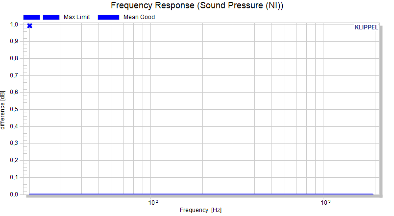
Defined second point of max limit at 1 dB above the mean curve at 2000 Hz:
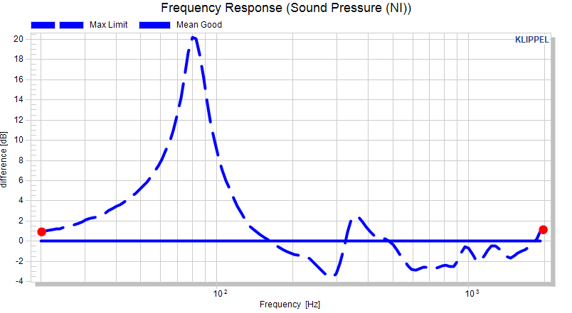
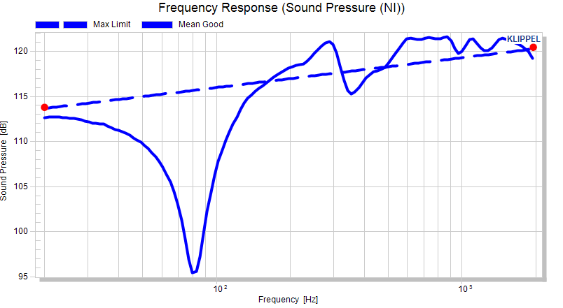
The result might look strange but a look at the data in the absolute view mode along with the information from section Interpolation of limit definitions brings clarity: The two data points that were defined were defined as absolute limit, hence interpolated as absolute measure, which results in a straight line in absolute view:
Text export#
The text export is an open interface provided by the STAT module. It is the basis for importing Limits into Klippel QC.
Export file#
The parameter Export file defines the absolute or relative path to the plain-text file containing all exported data. The file is not reset on export. Existing data is overwritten, though. Data that is not exported is kept in the file.
Export for “…”#
For each measure the export may be defined:
Nothing:
Nothing is exported for the selected measure.
Calculated limits:
The absolute calculated limits (including jitter) are exported in full abscissa resolution.
Limit definition without reference data:
The limit definitions (minimum/maximum limit definition) and jitter are exported as defined. No reference data is exported.
Limit definition with reference pool statistic:
The limit definitions are exported as defined along with the statistical representation of the reference pool. If shift and factor are selected as limit calculation mode, this is the mean of the reference pool. If sigma factor is selected as limit calculation mode, this is the mean and the standard deviation of the reference pool.
Limit definition with full reference pool:
The limit definitions are exported as defined along with the full reference pool.
Reference pool statistic:
Mean and standard deviation of the reference pool are exported – limits or limit definitions are not exported.
Full reference pool:
The full reference pool is exported – limits or limit definitions are not exported.
File format#
The file format is compatible to Klippel QC. However, the file is in plain text and can be evaluated in any 3rd party software. The data is exported with the following variable names:
<meas>
Prefix for the exported variable names which represents the internal variable name of the measure. The variable names are documented in the individual manuals of the QC system.
<meas>ImportMin
Absolute calculated minimum/maximum limit or absolute limit definition representing the limit.
<meas>ImportMax
Format for each variable:
[2,N] – xy representation with N lines for curve measures
[1] – single value for scalar measures
<meas>Shift
Shift limit definition
Format:
[2, N] – xyMax representation with N lines for curve measure if only max limit is defined
[3, N] – xyMaxyMin representation with N lines for curve measure if min and max limits are defined
[1,1] - yMax representation for scalar measure if only max limit is defined
[1,2] - yMaxyMin representation for scalar measure if min and max limits are defined
<meas>Mul
Factor limit definition - format as for shift.
<meas>Sigma
Sigma factor limit definition - format as for shift.
<meas>Jitter
Jitter definition (if limit definition is exported) – only exported for curve measures
Format:
[2, N] - xyJitter representation with N lines
<meas>ImportMeas Reference data or mean data of the reference pool (depending in export setting)
Format:
[2,N] – xy representation with N lines for curve measure if mean is exported
[1] – single value for scalar measure if mean is exported
[M+1,N] – xy1y2…yM representation with N lines for curve measure if the full reference pool is exported with M test objects
[M] – y1y2…yM representation for scalar measure if the full reference pool is exported with M test objects
<meas>ImportStDev Standard deviation of the reference pool
Format:
[2,N] – xy representation with N lines for curve measures
[1] – single value for scalar measures
Pooling#
Move by limits#
Test objects may be moved to another pool. The button

moves all test objects outside of the calculated limits from the source pool(s) to the target pool. All defined limits of all active measures are considered in this evaluation.
Please note that the current pool assignment may be viewed and changed in the window Pool Assignment.
Pool Selector#
This window presents the current pool assignment of test objects. The configuration of pools and the assignment may be changed manually.
Elements of the Pool Selector#
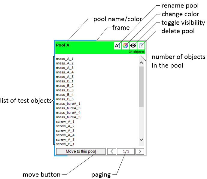
Selecting a Pool#
By clicking on a pool (e.g. object list, a button or the header) the pool gets selected (frame changes from gray to blue). This enables the keyboard shortcut CTRL + A to select all objects on the shown page of the pool.
The current and total page number are shown in the paging section.

Clicking on the current page opens a select list to jump to a page.
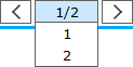
The button left of the current page goes to the previous page, the one right of the current page goes to the next page.
Paging#
The test objects are shown in pages. The total number of test objects (all pages) is shown in the header of the pool.
Renaming a Pool#
Use the button  to rename a pool. Windows are updated automatically. It is not possible to
rename the pool General because it is a fallback pool for deleted test objects.
to rename a pool. Windows are updated automatically. It is not possible to
rename the pool General because it is a fallback pool for deleted test objects.
Change the Pool Color#
The button  opens the color picker dialog to change the pool color.
Hiding/Showing a Pool#
Use the button  to hide a pool from all plots and tables. Use the button
  to
show the pool again. Windows are updated automatically.
to
show the pool again. Windows are updated automatically.
Delete a Pool#
Use the button  to delete a pool. All contained test objects are moved to the General
pool.
to delete a pool. All contained test objects are moved to the General
pool.
Select Test Objects#
Clicking on test objects with the left mouse button selects single objects. To add test objects to the selection, use the CTRL key.
Range select is also supported: select one test object with the left mouse button (e.g. the first in the list), press the SHIFT key and select the desired end of the range with the left mouse button.
To select all test objects in one pool, select the pool and the use CTRL + A.
Move Test Objects#
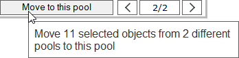
Every pool has a move button at the bottom. All selected test objects (from all pools) are moved to a pool if the button is used. The tooltip shows some additional information.
Manually Create a New Pool#
Use the button  to create a new empty pool.
Windows#
Pool Assignment#
This HTML window shows the pools and test objects in their assigned pool. Please refer to the section Pool Selector.
Default result charts of measures#
The result charts are named after the measures they show. The charts are shown if a measure is active, they are destroyed if a measure is deactivated.
Cross section charts#
If the cross section view is active for a curve measure, a dedicated chart for the cross section view is created.
Measure Overview Table#
This HTML table shows a statistical overview of measures and pools. For scalar measures (and curve measures with cross-sections) the maximum, minimum, mean and standard deviation are shown.
For all measures, the number of test objects for a measure is shown.

The table can be exported with via the button below the table.

Yield Statistics#
This window shoes the percentage of pass objects compared to all objects for each measure of each pool. It may be used to see how many objects would be moved with limit-based pooling.

Golden Unit Ranking#
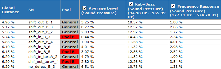
This window shows the golden unit ranking (sorted by distance to the reference). The individual measures may be selected/deselected for the global ranking with the checkbox.
Detection of Golden Units#
The STAT module features a detection of golden units, which means that the test objects are detected that fit best to the reference curve/value.
Including Measures#
Each measure may be included in the calculation of the global ranking of the golden units. The setting may be defined for all active measures or for the active measures individually.
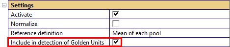
Additionally, the checkboxes in the window Golden Unit Ranking may be used to include measures in the global ranking.

Restrict x-range for detection#
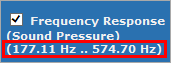
If limits are defined, the STAT module restricts the abscissa (x-axis) of curve measures for the golden unit detection to the overall range of the limits. If no limits are defined, the complete abscissa is used. The used x-range is displayed in the header row of the golden unit ranking.
Ranking Calculation Details#
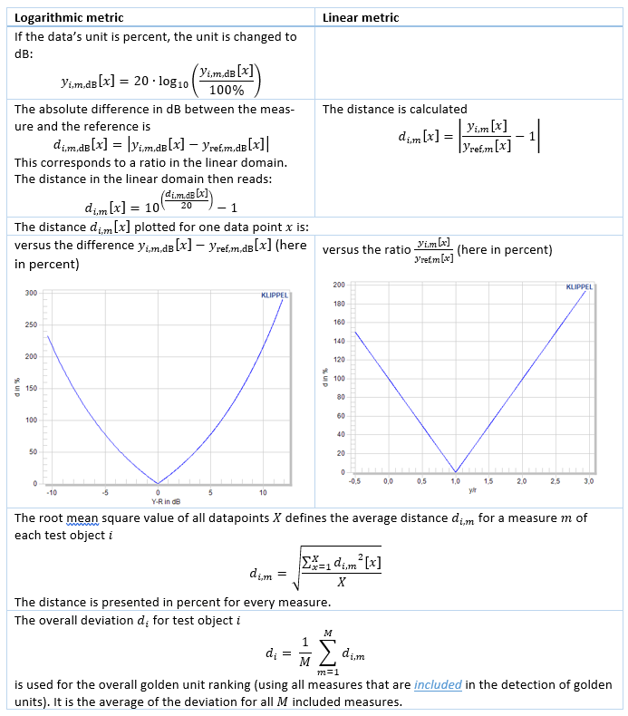
The ranking bases on the distance of the individual test objects to the reference data (e.g. the mean of the data pool). The calculation method for the distance is depending on the input data’s unit either in a logarithmic or linear metric. The calculation method may be changed if the advanced parameters are shown. The default (and recommended) method for different measures are shown in the next table.
Logarithmic metric
All values in decibel, e.g.:
Frequency response
Absolute THD
Relative THD in dB
Voltage in dB(rel. 1 V)
Current in dB(rel. 1 A)
…
Relative THD in percent
Linear metric
Measures with linear units
Ohm
V
mm …
Other measures in percent (e.g. voice coil offset – if not presented in mm)
The distance between a data set \(y_{i\text{,}m}\lbrack x\rbrack\) to a reference \(y_{\text{ref,}m}\left\lbrack x \right\rbrack\) is calculated for each data point \(k\) of each measure \(m\) for each test object \(i\).
For each measure \(m\) of every test object \(i\) the distance of the all data points \(x\) between a data set \(y_{i\text{,}m}\lbrack x\rbrack\) and a reference \(y_{\text{ref,}m}\left\lbrack x \right\rbrack\) is calculated. The reference data
Trigger Detection of Golden Units#
Trigger the detection of golden units via the according in the property page (tab Processing, category Actions).

Export of Golden Unit Ranking#
The export of the golden unit ranking can be triggered via the HTML link in the window Golden Unit Ranking.

The export could also be triggered via the button in the property page (tab Export, category Golden Unit Ranking).

Peculiarities for special measures#
Phase measures#
Phase measures are always plotted unwrapped (not limited to values +/- 180°) to ensure a meaningful statistical analysis. Please note that the unwrapping algorithm assumes a phase difference in between data points below 360°.
Frequently Asked Questions#
General#
Do I need a license to view a statistic from a colleague?#
A license is not necessary for just viewing a statistics operation. Operating the module will not work though.
The statistics module is very slow at first change.#
The first parameter change triggers the preparation of the work space (extraction of raw data, work data and configuration files. This might take a while. Unless the operation is unloaded, the module should operate smoothly.
Data Acquisition#
What is db extract again?#
The software db extract is only used for data extraction and triggered via the buttons in the category data acquisition.
The progress bar during the extraction of data decreases sometimes, this can’t be right, can it?#
The STAT module reads in the data from db extract, whereas db extract reads the KDBX files. Both processes are running parallel.
When the progress bar message reads Reading data (parallel extraction) … the STAT progress bar shows the ratio of read data to extracted data (by db extract). In this case it might happen that db extract adds more data than the STAT reads – then the ratio decreases.
Once db extract is finished, the progress bar message reads Reading data… and the progress bar should be strictly monotonic increasing.
What is the difference between General and QC Results?#
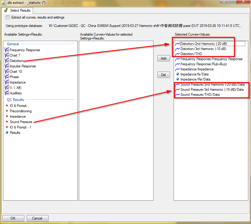
“General” refers to a general way to obtain the data. This works for RnD and QC data. The QC Results are specific access for results of the QC module. If QC results are to be analyzed, it is recommended to use the special way to select the data. This allows important meta data (e.g. serial number) to be extracted parallel. This meta information is fed to the STAT automatically.
Setting of measures#
What the does the checkbox status  stand for? I was expecting only
  and
and  .#
.#
This status stands for “undetermined”. Every checkbox can be defined as either set (
) or
unset (
). If parameters are configured differently for different measures (e.g. if the
flag – Show Mean is set for the fundamental, but not set for Rub&Buzz) and the measure selection
is switched to All measures, the flag status is undetermined.
How can I set a checkbox to undetermined status?#
You can’t. Please let us know your use-case.
What does (varying) mean?#
The entry signals that individual measures are configured differently when All measures is selected in parameter Available measures. This is the equivalent for the undetermined checkbox status.
Limit Calculation and Export#
When switching between limit calculation modes, the displayed limits are completely different.#
The limit definitions are completely independent. When switching between the modes, the corresponding limits are shown which do not have to be related necessarily.
How can I calculate the shift mask based on absolute limits then?#
When switching into normalization mode, you can get the shift mask calculated from an absolute limit definition. Please note that in relative normalization mode, the factorized mask is shown, not the shift mask.
When I define limits with mouse input, the thick limit is not drawn at my mouse position.#
If a jitter definition is defined, the thin line represents the limit without jitter. Mouse input always inputs the jitter definition, regardless of the jitter definition. The thick line stands for the final limit, including jitter.
The limit that I define (e.g. with mouse) does not at all look like I expected. I expect a straight line in between the points I define.#
The points in between the limit definition are interpolated. When defining an absolute limit in a normalized view, the connection in between two points is not a line in most cases. Please refer to section Interpolation of limit definitions.
I want to move test objects based on defined limits. When I use the trigger button to move the test objects, objects that do not violate the limit are still moved.#
One possibility is that another measure is violating the limits. Make sure you considered all defined limits.
If e.g. only one measure has limits, maybe a normalized view is misleading. This may happen, if the normalization mode is set to mean of each pool, this leads to different references for each pool. Let’s make a reduced example with only two pools (in each only one test object):
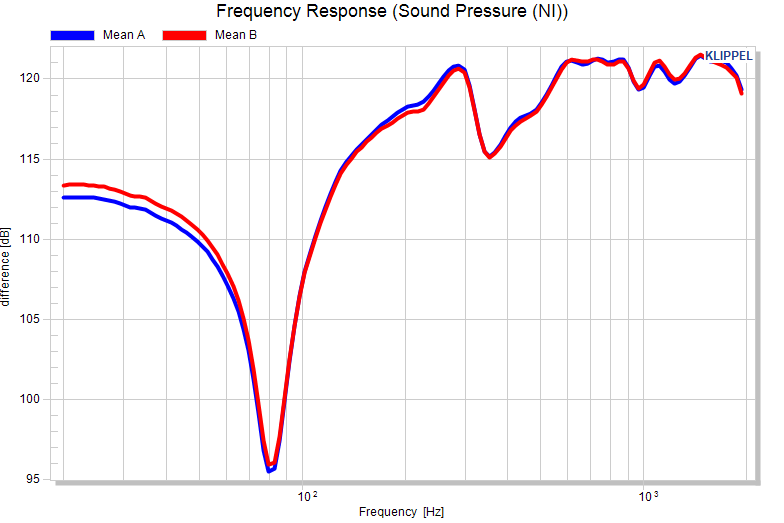
Now, let’s set a +/- 0.5 dB shift limit and normalize the plot with reference “Mean of each pool”, the mean of pool A and B are forced to 0 dB. Everything looks fine, but in fact pool B violates the limit (and would therefore be moved when using the defined limits as criterion).
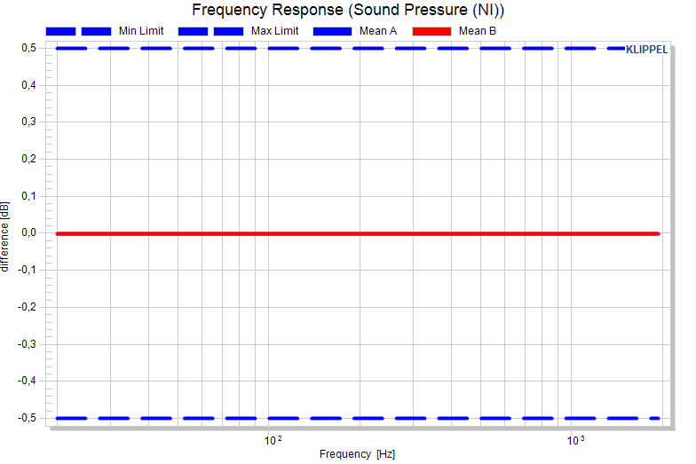
It becomes clear, when we normalize the plots to the mean of the reference pool A:
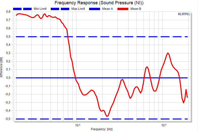
Pooling#
I want to compare how two batches compare statistically. How can I do that?#
Separate the test objects in two different pools (e.g. manually in the window Pool Assignment by using different prefixes or different serial number ranges for the two batches).
I already have the two batches as databases and I didn’t use special prefixes or serial number ranges to identify the batches.#
In that case you probably have the database files in two different locations. Just run two extraction after another for the different batches. After the first is extracted, move all test objects to a pool. Then run the extraction for the second batch. They will be assigned to the general pool and may be moved to a separate pool once the second extraction finished.
